Cricket Scorecard Columns and the Logic of a Scannable Page
Cricket scorecard columns make match records easier to scan by separating player details, batting figures and bowling returns into clear visual groups.
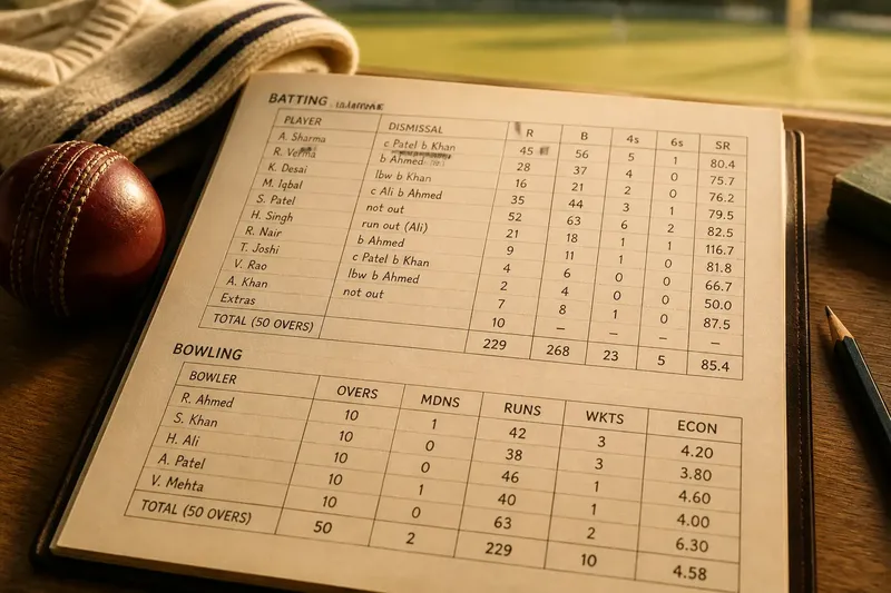
How do cricket scorecard columns help you find a particular figure without reading every entry? Cricket scorecard columns divide a crowded match record into visual groups, giving the eye a route from a player’s name to the relevant figures and back to the innings total.
That route is the page’s quiet design work. A scorecard must accommodate names, changing totals and several kinds of numerical detail without making them look interchangeable. Its layout answers a simple question: where should the reader look next?
What does each column contribute to the scorecard?
Each column gives one kind of information a predictable place. A batting section commonly sets a player’s name apart from the figures that describe the player’s innings, while a bowling section groups the figures associated with a bowler. The precise headings vary, but the principle remains: put unlike information in distinct lanes.
The name column is usually the most generous because names vary in length and need to remain readable. Figure columns can be narrower, provided their entries line up and their labels make sense. A page that gives a short label the space of a full name has spent its room badly; a page that squeezes a long name into a narrow slot risks making identification work harder than calculation.
Columns also establish relationships. A number directly beneath a heading belongs to that category; a number separated by a ruled boundary belongs elsewhere. Readers should not have to infer that relationship from position alone, particularly when a scorecard contains several adjacent fields.
Think of the columns as a sentence structure made visible. The player’s name identifies the subject, and the figures to its right describe different parts of the record. If those figures drift across the page, the structure becomes harder to read even when every entry is correct.
How should batting and bowling sections be arranged?
Batting and bowling information should be separated into clearly named blocks, not forced into one continuous field of numbers. Their headings and columns serve different reading tasks, so a reader should be able to tell at a glance which section contains the information being sought.
A batting block often places player names on the left and their associated figures to the right. It may also include rows for totals and other innings details. A bowling block has its own set of labels and can use a different column order. The exact contents depend on the scorecard’s purpose; visual separation matters more than preserving one universal arrangement.
Give each block a heading with enough contrast and space to establish a new section. A heavier rule, modest gap or change in type weight can do the job. Adding decorative flourishes to every boundary cannot. If every line is emphatic, none tells the reader that a new kind of record has begun.
Keep related totals close to the block they describe. A figure parked far below its section may appear to belong to the next one, especially when the page is dense. The reader should not have to follow a trail of tiny arrows or footnotes to reconnect a heading with its entries.
How much spacing does a scorecard need?
Enough to keep adjacent entries distinct, but not so much that their relationship becomes uncertain. Space is not merely unused paper. It separates categories, makes rows easier to track and lets a section heading attach itself to the material below.
Vertical spacing helps readers move from one player row to the next without losing their place. Horizontal spacing distinguishes neighboring figures, especially where short labels and narrow entries sit close together. A little breathing room around a heading signals that it belongs to the section rather than to the preceding row.
Line rules can help, but they should support spacing rather than replace it. A thin rule between every cell can turn the page into a small cage. Leaving some boundaries open often makes the hierarchy easier to read: use stronger separation for major sections and lighter treatment for ordinary rows.
For a compact printed card, consistent spacing is usually more useful than generous spacing in one area and cramped spacing in another. For a digital scorecard, the same principle applies when the page changes size: a column that looks tidy on a wide screen may collapse into ambiguity on a narrow one. The layout should preserve grouping when viewed at its intended reading size.
Which labels make a scorecard easier to scan?
Use short, familiar labels that identify the information beneath them without requiring a second key. A label can be compact, but it should not become a private abbreviation known only to whoever arranged the page.
Labels do several jobs. They tell the reader what a column contains, distinguish neighboring figures and provide a point of reference when scanning down a section. They also need to remain connected to the data: a heading placed too far above its columns can be detached from them visually, while one repeated in every row adds clutter.
Choose a consistent style for similar labels. If one section spells out a term and another uses an abbreviation, the difference may look meaningful even when it is not. Capitalization, alignment and weight can help signal the label’s role, but they should not vary at random.
Abbreviations are useful where space is genuinely tight. Make them legible, keep them consistent and provide a small key when the intended reader may not know them. The key should clarify the page, not become a second page whose chief purpose is explaining the first.
Should figures be aligned left, right or at the decimal?
Align figures according to how readers compare them. Right alignment often makes whole numbers easier to scan because their final digits form a clean edge. Decimal alignment can help when values include decimal parts. Left alignment is usually more suitable for names and descriptive text than for a column of changing numerical lengths.
Consistency matters more than fashion. When figures in one column use different alignments, their varying widths can disguise which entries belong together. A reader may find the right value eventually, but the page has made a simple visual task needlessly fussy.
Do not use spaces typed by hand to imitate column alignment. Fonts have different character widths, and a later edit can shift the apparent positions. Set the table’s columns or use a proper tabular layout so that the values remain aligned when names or entries change.
Make the type large enough to read at the scale where the card will be used. A dense scorecard may tempt its designer to shrink every label and figure until they fit. That solves the problem of space by transferring it to the reader’s eyesight, which is not a particularly elegant exchange.
What should a reader check when scanning a scorecard?
Where do I find a player’s figures?
Start at the player’s name and read horizontally beneath the relevant section heading. The column labels tell you what each nearby figure represents, so follow them rather than assuming that adjacent numbers share the same meaning.
Why are totals separated from individual entries?
Totals summarize a block rather than describe one player’s row. Their position, spacing or type treatment should make that difference visible without making them look unrelated to the entries they summarize.
What if two columns seem to run together?
Use the headings and alignment to establish the column boundaries, then check whether a rule, gap or repeated position separates the entries. If the distinction remains unclear, the page layout has left too much work to the reader.
Can a scorecard be readable without heavy grid lines?
Yes. Clear alignment, consistent spacing, restrained rules and distinct headings can organize a table without boxing every cell. Grid lines are one tool, not a substitute for a useful hierarchy.
How can a small layout change improve a crowded card?
Say you are laying out an invented club scorecard and a long player name pushes its neighboring figures out of alignment. Move the name into a wider first column, keep the figure columns right-aligned and add a modest gap before the next section. The expected visible result is a straighter run of numbers and a clearer break between the batting and bowling blocks.
That kind of adjustment is preferable to shrinking all the type. It changes the space allocation where the problem starts and preserves a readable scale elsewhere. A crowded scorecard often needs a better distribution of room, not more visual decoration.
Before finalizing a layout, inspect it at ordinary reading size. Check that names do not collide with figures, that labels sit above the correct columns and that totals remain attached to their section. If the card will be printed, view a print-sized version rather than judging only from an enlarged screen preview.
What is not worth the effort is adding a different color to every column or giving each figure its own box. Those devices create more boundaries, but not necessarily more meaning. A scorecard is already a table; it does not need to audition as a mosaic.
Good cricket scorecard columns make the page’s reading order apparent: find the section, locate the name or label, then compare the figures that belong together. That is the useful test of cricket scorecard columns. A reader should be able to follow the record with their eyes, not reconstruct the designer’s intentions one cell at a time.